
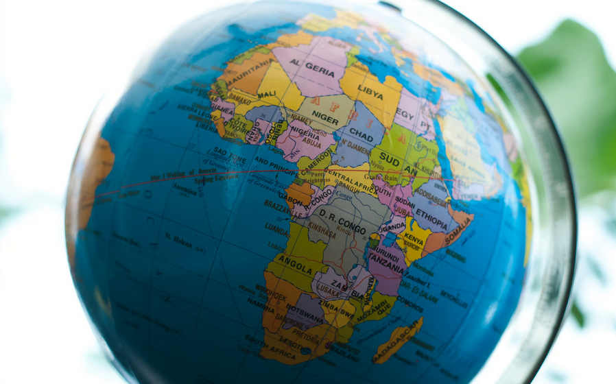

For generations, millions of people have grown up looking at a world map that gives them a badly distorted idea of how large Africa actually is.
The familiar Mercator map of Africa is part of the reason. Africa has an area of roughly 30.37 million square kilometers. Greenland is only about 2.17 million square kilometers. Africa is therefore approximately 14 times larger than Greenland, yet on many Mercator world maps the two can appear surprisingly close in size.
That is not because the Earth changed. It is because turning a globe into a flat rectangle requires distortion, and the particular distortion used by the Mercator projection dramatically enlarges land near the North and South Poles.
There is also a more uncomfortable question: why did a map with such obvious distortions remain one of the world’s most recognizable representations of the Earth for centuries?
The answer sits at the intersection of mathematics, navigation, European expansion, colonialism and culture. There is no good historical evidence that Gerardus Mercator deliberately designed his projection to make Europe look powerful or Africa look insignificant. The map was built for navigation. But the projection later became deeply embedded in a European-dominated world, and its visual distortions fit remarkably well with a political order that placed Europe near the center of global power.
That distinction matters. The origin of the distortion was mathematical. The persistence and cultural meaning of that distortion are much more complicated.
Table of Contents
Why This Question Is Back in the News
On September 4, 2026, the United Nations General Assembly overwhelmingly approved the African-led “Correct the Map” resolution.
The measure received 164 votes in favor, with the United States casting the only vote against it and six countries abstaining.
Togo introduced the initiative on behalf of the African Group after the African Union had already endorsed the effort earlier in 2026.
The goal is not to pretend that there can be one mathematically perfect flat map. There cannot. Every flat map sacrifices something. Instead, the campaign encourages governments, schools, media organizations, international institutions and digital platforms to understand those tradeoffs and use projections better suited to accurately comparing the sizes of regions.
The African Union has adopted the Equal Earth projection for that purpose and urged member states to incorporate more accurate cartographic representation into education.
The controversy therefore raises a larger question than which map should hang on a classroom wall. It asks how a technical navigation tool created more than 450 years ago became one of humanity’s default mental pictures of the planet.
What the Mercator Projection Actually Is
Gerardus Mercator was a Flemish cartographer who published his famous world projection in 1569.
Its original purpose was extremely practical: navigation.
Sailors needed a map on which a constant compass direction could be represented as a straight line. The Mercator projection was remarkably useful for that purpose because it preserves local angles and directions.
Imagine trying to peel the surface off a globe and force it onto a rectangular piece of paper. Something has to stretch.
Mercator’s solution increasingly stretches the map as it approaches the poles. That stretching allows directions and local shapes to remain useful for navigation, but it destroys accurate comparisons of area.
This is why Mercator can simultaneously be an ingenious map and a terrible map for answering a question such as, “Which continent is larger?”
It was solving a different problem.
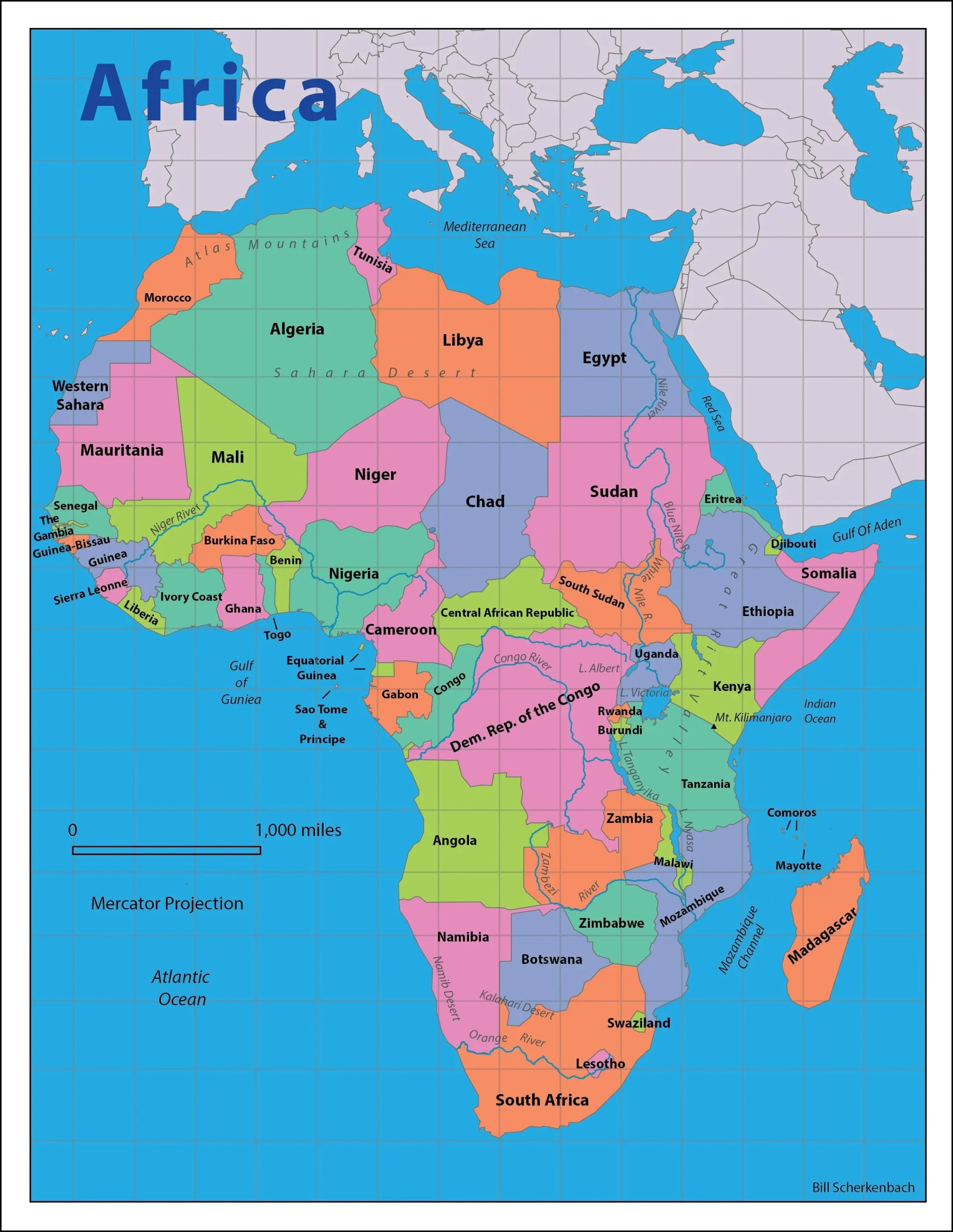
Why the Mercator Map Makes Africa Look Too Small
The distortion becomes more severe the farther a location lies from the equator.
Africa straddles the equator. Ghana itself lies only a short distance north of it. Much of Africa is therefore located where Mercator’s enlargement is relatively modest.
Europe, Canada, Russia and Greenland are much farther north. Mercator stretches them dramatically.
So when people say Mercator “shrinks Africa,” there is an important technical clarification: much of Africa is not being compressed nearly as aggressively as the northern world is being enlarged.
The comparison is what creates the illusion.
| Land Area | Approximate Size | Compared With Africa |
|---|---|---|
| Africa | 30.37 million km² | Reference |
| United States | 9.15 million km² | Africa is more than 3 times larger |
| China | 9.33 million km² | Africa is more than 3 times larger |
| India | 2.97 million km² | Africa is more than 10 times larger |
| Greenland | 2.17 million km² | Africa is about 14 times larger |
Look at many traditional classroom maps without knowing those numbers and you would probably never guess the differences were that large.
That is the heart of the controversy.
Was the Mercator Map Racist?
This requires a careful answer.
Mercator created his projection in the 16th century to solve a navigation problem. Its enlargement of northern land masses follows from its geometry.
Calling the mathematical invention itself a deliberate racist conspiracy would therefore go beyond the available historical evidence.
But that does not end the discussion.
A technology can acquire political and cultural meaning long after its creation. It can also continue to be used for purposes its inventor never intended.
The more defensible question is not, “Was Mercator secretly trying to diminish Africans?”
It is, “Why did societies continue using a navigation projection as a general world map when better choices existed for showing the relative size of continents?”
That question leads directly into European colonial history.
Where Colonialism Enters the Story
European mapmaking and European imperial expansion became deeply intertwined.
Maps were not merely pictures hanging on walls. European governments, explorers, militaries, trading companies and colonial administrators used cartography to survey territory, establish claims, organize transportation, locate resources, define jurisdictions and eventually draw colonial boundaries.
The modern political map of Africa itself was heavily shaped by European colonial partition during the late 19th and early 20th centuries.
This history matters because maps carry authority. When something appears on an official map, it can begin to feel objective and inevitable even when the choices behind that map were political.
European cartographic traditions also became global standards during the same period that European empires controlled large portions of Africa, Asia and the Americas.
By the 19th and 20th centuries, generations of students could encounter a world in which Europe occupied a visually prominent position while Africa appeared far smaller than its actual geographic importance would suggest.
Was that distortion invented for colonialism? No.
Could its continued use reinforce a Eurocentric view of the world? Absolutely.
This is close to the position the African Union has now taken. In its 2026 decision supporting the Correct the Map initiative, the AU described distorted cartographic representations as a legacy of colonial cartography and connected the issue with what it calls “cognitive justice.”
That is a political interpretation offered by African governments. It should not be confused with proof of Mercator’s personal motivations. But it reflects a much broader historical truth: European maps were part of the knowledge systems through which colonial powers described, divided and governed much of Africa.
Why the Size of a Country on a Map Matters
At first, the dispute can sound trivial.
Africa does not physically become smaller because somebody printed the wrong projection in a textbook.
But humans learn visually.
If a child repeatedly sees Greenland presented as something approaching the size of Africa, that image becomes part of the child’s mental geography of the world.
The same problem appears when Europe visually dominates maps despite Africa being roughly three times its land area.
Size can also carry psychological associations with importance, resources, population, distance and power.
The African Union argues that distorted representations can contribute to the perception of Africa as peripheral or smaller in significance than it actually is.
This does not mean a map projection caused colonialism, racism or modern economic inequality. Those would be enormous and unsupported claims.
It means maps participate in the way societies imagine the world.
That is why cartography is never purely about drawing coastlines. Choices about projection, scale, orientation, labels, borders and what receives visual emphasis all affect what viewers notice.
What the Mercator Map Distortion Means for Ghana
Ghana provides a useful example because the country lies relatively close to the equator.
On the Mercator projection, Ghana does not experience anything close to the extreme enlargement seen in Greenland, northern Canada or northern Russia.
Yet Ghana sits inside an African continent whose apparent global scale is changed by the enormous enlargement of those northern regions.
Someone looking at a Mercator world map can therefore develop the mistaken impression that the distances, land area and geographic scale of Africa are considerably smaller relative to Europe and North America than they really are.
For readers trying to understand Ghana’s physical location, regions and geography, compare this wider discussion with GhanaCitizenship.com’s existing Ghana Map, Regional Structure and Capital reference page.
Ghana is also part of the African Union, which formally adopted the Equal Earth projection in February 2026 and encouraged its member states to revise educational curricula accordingly.
For African governments, that makes the map debate part of something larger: deciding how Africa is described to Africans themselves and to the rest of the world.
What the Equal Earth Map Changes
The Equal Earth projection was introduced in 2018 by cartographers Bojan Savric, Tom Patterson and Bernhard Jenny.
Its major advantage for this debate is contained in its name: Equal Earth is an equal-area projection.
That means a region covering twice as much land on Earth also covers twice as much area on the map.
Africa therefore receives the geographic weight it actually possesses.
Greenland becomes visibly much smaller. Africa becomes unmistakably enormous. Countries and continents closer to the poles no longer receive the enormous area inflation created by Mercator.
Equal Earth does not eliminate every distortion. No flat map can do that.
Instead, it prioritizes accurate relative area while trying to preserve recognizable continent shapes. Its designers specifically intended it as a visually appealing equal-area alternative suitable for world maps.
Mercator can still be useful where preserving direction or local angles matters. Equal Earth is better when the purpose is teaching people how large different parts of the world actually are.
That is why the best lesson from the current debate is not that one map is “true” and every other map is “false.”
The real lesson is that maps should be chosen according to what they are supposed to communicate.
The Bottom Line: The Map Was Mathematical, but Its Legacy Became Political
The distorted size of Africa on the traditional Mercator world map did not begin with a documented racist plot.
It began with mathematics.
Gerardus Mercator wanted sailors to be able to follow constant compass bearings on a flat chart. His solution worked extraordinarily well for that purpose and necessarily distorted area as it approached the poles.
The political story came later.
Europe spent the following centuries expanding colonial empires across much of the world. European institutions, educational systems and cartographic conventions spread with that power. A map that visually enlarged Europe and other northern regions became one of the world’s most recognizable images of geography.
Whether intentional or not, the result reinforced a world view in which Africa could literally appear smaller.
That is what today’s Correct the Map movement is challenging.
The United Nations vote does not change the physical size of Africa. It changes something more subtle: the willingness of international institutions to question whether a centuries-old European navigation tool should still serve as humanity’s default picture of the planet.
Africa was always approximately 30.37 million square kilometers.
The map simply did a poor job of showing it.
Sources
- African Union – Decision Assembly/AU/Dec.959(XXXIX), “Correcting the Map of Africa on the Globe,” February 2026.
- African Union – “AU leaders adopt historic initiative to correct the Map of Africa,” June 12, 2026.
- United Nations General Assembly – Draft Resolution A/80/L.104 and proceedings of the 114th plenary meeting, September 4, 2026.
- National Geographic Society – Gerardus Mercator and the history and purpose of the Mercator projection.
- Esri – Technical explanation of Mercator and Web Mercator area distortion.
- Equal Earth – Technical background on the Equal Earth projection.
- Cambridge University Press, Journal of Navigation – Historical research on Mercator’s 1569 world map and navigation.